insanelab.com insanelab.com

January 16, 2017 - Web Design

16 Web Design Trends to Expect in 2017

by Antoni Żółciak
More by this author

Cherry picking. Optimizing. Refreshing.

2017 will be huge for lots of businesses concerned with making their website as user-friendly as possible. Companies are drawing consumers in by making the navigation effortless, the design simple, and the mechanics foolproof. The convenience of having a credible online presence and an additional sales instrument that works around the clock are things that every establishment needs to be aware of nowadays.

In fact, more and more organizations are getting ready for a mobile-first world and things like responsive web design are no longer a trend, but a necessity.

Still, though, there are some new (or continuing) trends to look forward to. We already discussed one of them – an RWD variation that focuses on the user’s age. Today, we’ll shift your attention to issues that are either already popular, or will emerge sooner than you might think.

Duotones

According to Wiki, it’s “a halftone reproduction of an image using the superimposition of one contrasting color halftone over another.” More often than not, it simply means that a designer is utilizing a pair of colors to create a vibrant image.

The trend originates from print design and it’s also widely used in photography. It’s absolutely not something that was introduced in 2016. Duotones were popular even at the beginning of 20th century. Winold Reiss, a German-born American artist, worked with duotones frequently in his lithographs. The one you see below is one of his most renowned works.

And he created this in 1915.

Winold Reiss, “Drawing in Two Colors.” Also published under the title “Interpretation of Harlem Jazz I.” Print on Japanese paper, offset lithograph and halftone in two colors. Published under public domain.

For now, let’s return to 2016, where duotones are among the most trending color styles in web design. The tendency will most likely continue during the next 12 months. Spotify did fun stuff with it for its Year in Review (both 2015 and 2016).

Web design duotone examples from Spotify, MailChimp, Tumblr and Adidas

Other major brands, such as Adidas, Tumblr, or MailChimp, have also used duotones for some of their projects. However, as with all trends, only time will tell if duotone will survive in web design on a massive scale.

Flexbox Is Quite Useful Now

Long story short: Flexbox (Flexible Box Layout) is good to go now. Until recently, the module was not really supported by the browsers. From its original release in 2009, it has come a long way and has even been acknowledged by the mighty Internet Explorer. Alas, there’s still the backward compatibility problem, but… Well. Some data is still stored on floppy discs, isn’t it?

Current browser support for Flexbox is available here.

Tip

Analyze your traffic with Google Analytics to determine which browsers most of your visitors use. Consideration of implementing Flexbox should begin with these stats.

Flexbox might be considered difficult to learn, but the advantage of implementing it is substantial. This next-generation design tool helps to create CSS layouts consisting of a grid of media elements. With that in mind, we can effortlessly align, center, justify, scale, and reorder elements of a website. For multi-column designs, Flexbox replaces a whole lot of different solutions, such as floats, clearfix hacks, or table display layouts. Below, you’ll see a useful example of how Flexbox works for alignment. You’ll find more samples on Treehouse’s blog.

An example of how Flexbox works. The justify-content property along the start and end line.

Flexible containers are also perfect for mobile screens and responsive content. Moreover, HTML5 web applications can benefit from this model.

Parallax? Impressive, but only in few selected cases

At Insane Lab, we love parallax. Here’s the thing, though: it’s not universally practical. It extends a website’s loading times. If implemented in the wrong way, it may even confuse the user. It’s still a hot trend and there’s nothing wrong with taking advantage of it – as long as you don’t overuse it and know when to apply it.

There are some beautiful examples of parallax scrolling. The first that comes to mind is Firewatch. Six separate layers provide an immersive effect as if you were watching the scenery from a helicopter.

Another example would be a graphic novel by Peugeot. It’s a popular project that used parallax for their storytelling mechanism. Costa Coffee went with a similar concept for their Experience project. Then there’s this great thing that The New York Times did two years ago.

Clearly, parallax can be applied reasonably. It can enhance the content and create an opportunity for deep engagement. Yet, like all things that we tend to do too much of, it can just as easily destroy the experience.

Getting Rid of Stock Images That We All Hate

We all secretly (or openly) loathe stock photos. Let’s be honest here: there is no way to do something great with most of the available imagery. Terms like “people in the office smiling,” or “young professional in a call center,” or “a friendly doctor” might have worked 10-15 years ago.

Enough.

In 2013, a service called Death to the Stock Photo was launched. Two photographers were really fed up with bad tasteand overwhelming use of of the same pictures everywhere.

Within six months, more than 20,000 creatives had joined the newly-formed “movement.” Several other similar sites surfaced and started offering high-quality, stylish stock photographythat is free from copyright restrictions or simply licensed under CC public domain. Examples would be:

And, oh, are they excellent! Especially taking into consideration that they’re all free. Check out some of the examples from Unsplash below:

And here are some more photos. This time from Death to Stock, the Tactile set:

PWAs Instead of Apps?

It’s not really a matter of PWA versus an application. The question is when to create PWA instead of a conventional app.

Progressive Web Apps are – by some – considered the future. They may not bring world peace, but they do deliver an app-like user experience within the browser. That’s huge, since the user doesn’t have to install a separate program. It’s enough to simply enter a desired URL and get on with it.

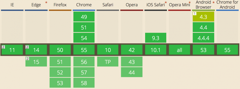
PWAs have been around for almost two years now. Finally, we’re getting to the point where the hardware access that Progressive Web Apps offer is vast. At What Web Can Do Today an author can determine whether he or she can rely on the browser features to build an app.

For example, a mobile browser can support geolocation, device vibration, screen orientation, battery status, adding an icon to the home screen, clipboard access, and more. Both on Android and iOS PWAs are becoming major points of interest. Service Worker is not yet available under Safari, however you can take PWAs for a ride with Chrome.

Also, building a Progressive Web App is plain cheaper than the alternative.

Read more: Progressive Web Applications: The Thing to Consider When Short on Resources

Read more: Here’s Why We Decided to Do Xamarin Mobile Application Development

SVGs

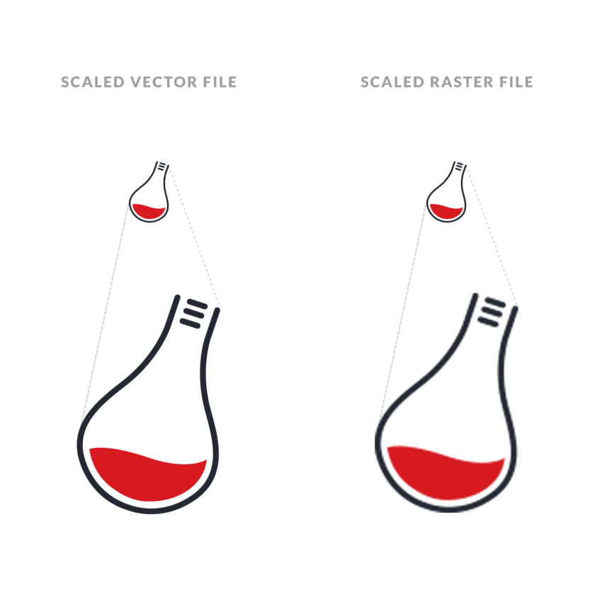
Spoiler alert: this is not new. SVGs have been around for some time now. In 2017, it’s a must-have.

Compared to JPG, BMP, or PNG, SVGs (Scalable Vector Graphics) are totally different. This file format ensures two important features:

  • It’s lossless.
  • It’s a vector file format.

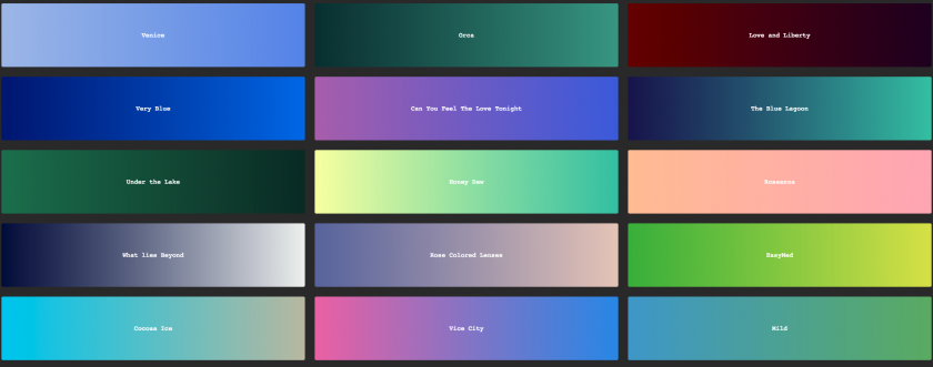
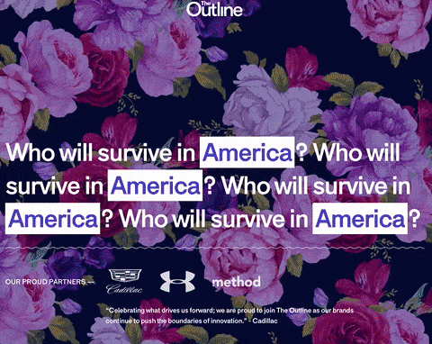
SVG images are composed of lines and curves, not pixels. This is a perfect solution for logos, icons, and basically anything else you’d like to keep sharp at all resolutions. Whether it’s a smartphone, a desktop, or a Retina MacBook Pro – it will look great.

Another advantage of utilizing SVGs is that they’re lightweight, even if they seem large visually.

Watch out for complicated SVGs. They require more computing power on the user side due to complex mathematical calculations. Be sure to find a sweet spot and don’t introduce something overly complicated.

The fun part is, SVGs are written in XML. You can literally modify them with a text editor. You don’t have to do that, though. Illustrator, Inkscape (this one’s free), or Sketch are also viable options.

You don’t have to worry about browser support for SVG. Currently, every widespread web browser can read and display the code, including Internet Explorer and Edge.

SVG takeaways

  • Use JPEG or PNG for a photo
  • Go for SVG when you have a flat and simple asset that you want to scale
  • Use PNG if you need transparency

Gradients 2.0

As long as gradients don’t have anything to do with skeuomorphism, you’re golden. For the last couple of years, gradients have been making a comeback. It all started with iOS 7.0 and the new design language. Now it’s everywhere, ensuring a color-rich background, simplicity, and minimalism.

Animation Will Be Huge(r)

Immense, immersive, bold, and engaging! Long story short, animation in web design is a heavyweight. In fact, we’re working on an animation for one of our clients right now. It will take more time than usual, but the results will be worth it. And we won’t forget to share the project with you once it’s done.

The content of animations can vary, but most of the time the idea is to present a user with a natural interaction environment. In a world full of hamburger menus and minimalistic designs, it’s nice to see something different every so often. Even if we’re talking only about cinemagraphs.

Layouts That You Won’t See Anywhere Else

Did you hear about The Outline? It’s a new online magazine by Joshua Topolsky, formerly associated with Bloomberg and The Verge. What he and his team did with The Outline is quite interesting. The design is genuinely unconventional, especially for a news and opinion outlet.

As you can see, the design is mighty. Absurdly distinguishable. Non-conformist. It would be utterly useless when applied to a horizontal portal, but for this kind of specialized publication, it’s an excellent choice in every way. It serves both as a consumption and marketing mechanism. When The Outline launched, people were not only talking about the articles. They were discussing this bold design, too.

Optimizing for Inbound Marketing

Finally! We’re seeing more and more companies shifting their budgets towards inbound methodology. Businesses are producing content, establishing their social media presence, and optimizing customers’ journeys throughout their web experience.

But inbound works only if your website is crafted with meticulous attention to detail. You need to create a website that’s optimized SEO-wise, with optimal loading times, and one that is responsive and compatible with the major browsers. Chances are, you’ll need custom solutions and digital “tailor-fitting”.

If you’re not sure if your website is in optimal shape, you can use one of the automated tools described here (or head there directly by choosing between GTmetrixPingdom, or PageSpeed Insights).

The Hamburger Menu Should Be Gone, But It’s Not

Spotify was mentioned before, but not in the context of UI/UX. As one of the most widely used and consumer-facing apps in the world, Spotify removed the hamburger menu back in May, 2016. Facebook got rid of this solution even sooner, switching to a tab bar.

The results of Spotify’s testing were notable, resulting in a 30% increase in clicking on actual menu items. The funny thing? The hamburger disappeared only from iOS, remaining on Android as it was. By no means is this an oversight. As TechCrunch reminds us, each platform’s user interface should be sympathetic to the operating system guidelines.

Okay, but what about the hamburger menu in your browser? Why do we have it on our own website if it’s so bad?

It doesn’t make any sense on desktop computers. Also, it doesn’t make any sense for an older audience. Okay, honestly? It doesn’t make sense anywhere with the exception of mobile (in some cases) and targets who are technologically savvy.

As you can see, Wojtek doesn’t really like hamburger menus. He’s the head of our design team. “For normal people, a hamburger menu doesn’t mean anything. You can put down Menu underneath the icon but it should be unquestionably more intuitive”, says Wojtek. “In terms of UX, a much better idea would be to insert the whole navigation bar on the bottom part of the screen.”

Remember the Music app on the first iPhone? Even after 10 years, the basic principles of the interface (especially the bottom-navigation-bar) are still applicable today. “Spotify did exactly that with its iOS app,” Wojtek emphasizes.

To be perfectly honest, we were also wondering if we should introduce a hamburger menu on Insane Lab’s mobile website. Keeping in mind our target audiences and ease of implementation, we decided to go for it.

I don’t think we’ll keep it, though.

Big Letters

Gritti Rollo is an Italian architecture and design company
Polargold is a German marketing agency

On AWWWARDS, you’ll see a first-class collection of websites created with big fonts. As the organization’s editor puts it: It doesn’t matter what kind of font you’re using. Size is the priority.

For a suitable business, huge letters are a great choice. Interior design firms, or any design firms for that matter, can greatly benefit from using this kind of form to display what they have to offer. They attract visitors through minimalism and attention to detail.

Custom Typography

How to distinguish yourself in today’s world? One way of doing so is to create a custom layout, or a design that has not been applied anywhere.

The other – to create custom and recognizable typography. Your own font that you’ll use throughout all of your communication, on your website, within your logotype. Everywhere.

It will take huge amounts of time, but what the heck – it’s worth it!

VR Web Design

This is going to be fun! VR has been gaining traction recently, and there’s nothing stopping it from dominating web design trends. More and more VR-compatible devices are available on the market at affordable price points. While the offerings may be directed towards gamers, for the most part, different kinds of consumers will also benefit from it. Imagine TV, movies, or even advertising in a virtual reality space.

VR is definitely coming. Hell, it’s already here. And it’s probably just a matter of time until it takes over the e-commerce industry.

Video with Sound

These kinds of websites will not resonate with everyone. People may be getting more accustomed to watching videos, but they do that in their own time. That’s why you should always let your visitors play the movie if they feel like it. Autorun should be totally banned in this case. Oh, and also, an option to mute the sound. This is crucial. It’s better to produce amazing content that users can’t imagine watching without sound – but don’t impose that.

For two to three years now, we’ve been seeing a continuous rise in Internet video popularity. And we’ve got stats to back it up:

  • Video in an email leads to a 200-300% click-through rate increase.
  • 64% of users are more likely to buy a product online after watching a video.
  • YouTube reports mobile video consumption rising 100% every year.

This is HUGE and will be even more significant as we move forward.

If you made it through the whole article – congratulations! You’re now well aware of the possible web design trends for 2017. We have a feeling that this is going to be an astonishing year. A year that will focus on depth versus width. We’re reaching the point where companies are actually paying attention to their customers. They go and engage with their fans. They try and display the information in the most friendly way possible.

We also believe that the only way to provide rewarding customer service is by making it as easy as it can be. A website that plainly works is a great start.

Long story short? Here are the most important takeaways for web design trends in 2017

  • Duotones might still be huge.
  • Flexbox is totally usable now.
  • Parallax is beautiful, but its practicality is debatable.
  • Rethink the stock images you’re using.
  • Consider Progressive Web Apps.
  • Consider native apps (Xamarin is a great choice) when PWAs are not enough.
  • SVG (Scalable Vector Graphics) are a must-have in 2017.
  • Gradients are still hot.
  • This will be a huge year for web animation.
  • Custom layouts for specific purposes are a good idea.
  • Optimizing your website for inbound marketing is an even better idea.
  • The hamburger menu probably won’t become obsolete.
  • BIG LETTERS are making waves in web design.
  • Custom typography is a great way to distinguish your business.
  • VR web design might become a fascinating practice.
  • The same goes for video with sound on landing pages.

What is your challenge?

Tell us with any means provided. We'd love to hear from you!