insanelab.com insanelab.com
Top Web Design Trends 2021

January 7, 2021 - Web Design

20+ Uncommon Web Design Trends to Look Out for in 2021

by Antoni Żółciak
More by this author

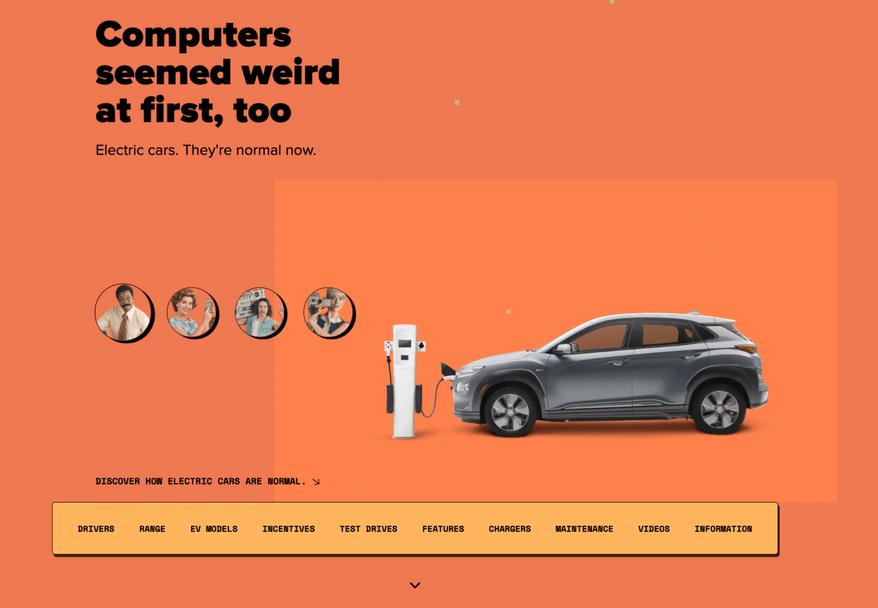
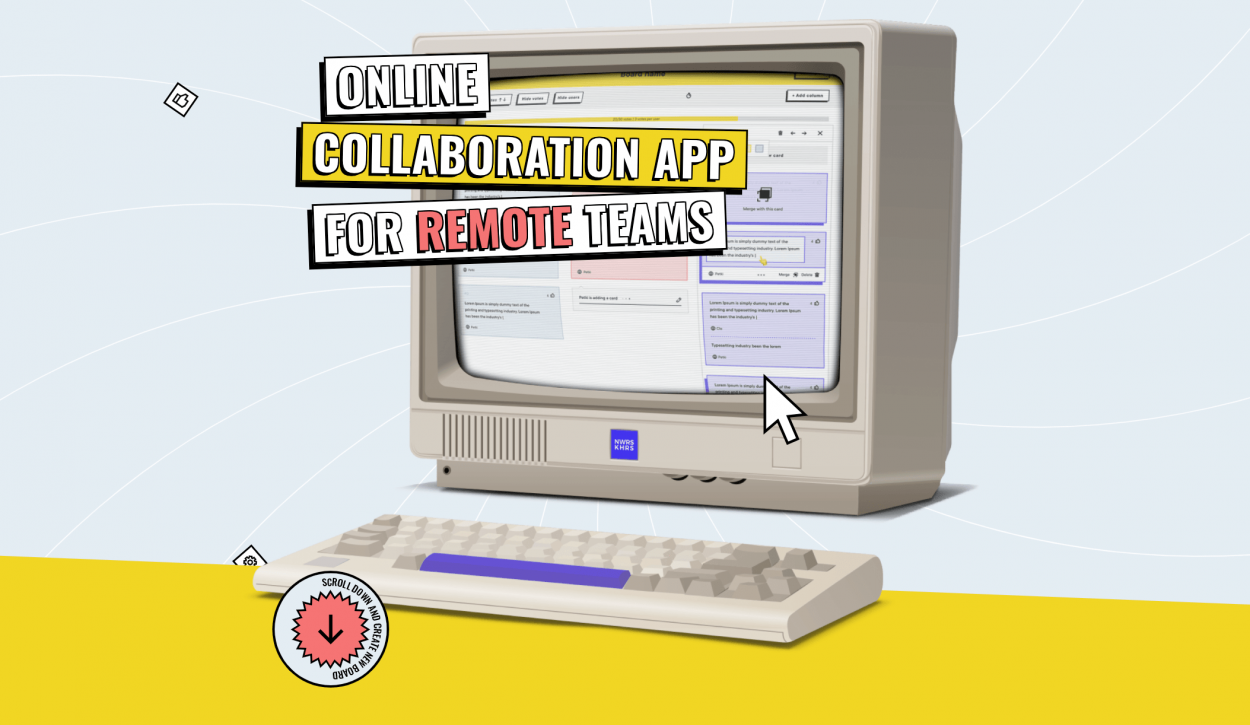
Web designers and developers need to update their knowledge regularly; without being aware of the most recent web design trends, they risk being left behind. It’s true for both individuals as well as companies such as agencies or software houses.

We’ve come a long way since August 6, 1991, where the first website, info.cern.ch, went online. Business Insider gently takes us back to the story of Tim Berners-Lee, the creator of this initial World Wide Web project that ran on a NeXT computer. By the way—the CERN info website is still online.

Today, almost 4.57 billion people are active Internet users. That encompasses 59 percent of the global population, and mobile is the most important channel for web access—it accounts for 91 percent of total Internet users (according to Statista). 

The number of websites on the Internet surpassed 1.74 billion in January 2020. It’s a huge market—one that requires any new site to offer the best possible experience for its users. And the design is not only about how things look. First and foremost, it’s about how things work. At Insane Lab, we believe that the best websites are born by taking care of both the functional, as well as the visual aspect of web design. 

Without further ado, let’s dig into the most recent web design trends for 2021.

Top Web Design Trends to Look For in 2021

  1. Website accessibility
  2. Optional dark mode
  3. Original 3D elements
  4. Motion design
  5. Designing for speed optimization
  6. Retro fonts
  7. Parallax
  8. Organic design
  9. Collages
  10. Brutalism and anti-design
  11. Illustrations and other hand-drawn elements
  12. Nostalgic design
  13. Use of yellow and gray
  14. Minimalism
  15. Horizontal scrolling
  16. Augmented reality
  17. Virtual reality
  18. Gaussian blur and glassmorphism
  19. Simple geometric grids
  20. Optical illusions
  21. Positive visual language

Website Availability and Accessibility of Use

AccessiBe—a one stop shop for website accessibility for ADA & WCAG compliance for 2021

In recent years website accessibility became not only one of the most important user experience challenges but also—in the United States—a legal requirement. Web designers worldwide have to take into consideration a variety of factors that will make any digital platform more friendly towards people with a diverse range of hearing, movement, sight, and cognitive abilities. 

As stated by the World Wide Web Consortium (W3C), “the impact of disability is radically changed on the Web because the Web removes barriers to communication and interaction that many people face in the physical world.” In 2020 and 2021, accessibility is considered essential for both developers as well as organizations that want to create high-quality websites and digital products.

Let’s take a look at some examples provided by W3C:

1. Alternative text for images

According to W3C, images should include “equivalent alternative text” in the markup or code. Most of the CMS platforms, such as WordPress, already have easy solutions that allow website editors to utilize this functionality. 

It matters mainly because if a person cannot see a picture—and is using a screen reader—then without an alt text the context is simply gone. 

Moreover, search engines incentivize website administrators to remember about the alt feature by promoting them on Search Engine Results Pages (SERPs).

2. Keyboard input

Imagine that you can’t use a mouse or a touchpad. How would you navigate the website? Enabling keyboard input for people with limited motor control not only gets you more readers but also makes them feel more comfortable, and your business more inclusive. 

3. Transcripts for audio

With a text transcript, people who can’t hear will be able to familiarize themselves with your content—it’s as simple as that. Bear in mind that providing a text transcript not only works for people who are deaf but it also works for search engines.

Optional dark mode as a new standard

Spider's Web portal in light mode

In 2020, dark mode started to pop up everywhere. This emerging user interface design trend has been noticed by researchers from Jönköping University in Sweden—Henriette Eisfeld and Felix Kristallovich. They published an extensive study on the functional aspect of dark mode.  

As we all began to spend significantly more time looking at our screens, web designers and developers began to take advantage of the practicality of this solution. As we can read in the research paper, “all operating systems, many apps, platforms, and even websites incorporated it in their design. Being an optional feature, Dark Mode makes it more comfortable for users to use their devices outside the light hours or in environments with low lighting conditions.”

Interestingly enough, an optional dark mode feature also makes users feel more in control—and, therefore, improves their overall satisfaction. There are also additional benefits associated with lower energy consumption of devices and providing a longer battery life (if our device is based on an OLED screen). 

Spider's Web portal in dark mode

The dark mode is also considered a retro trend—and we’ve all noticed this adoration for “blasts from the past.” Stranger Things takes us back to the 80s, vintage clothes are making a comeback—and dark mode is yet another embodiment of this nostalgia. What was deemed a technical necessity in the early days of computing is now an optional feature, not only good-looking but also practical.

As researchers point out, the dark mode is here to stay for years: 

“Since Dark Mode established itself as an option in operating systems and most apps, it is very likely to stay for years to come. The advantage of being just an option is clearly visible. As with many user interface styles, there are users that do not like Dark Mode for reasons like the personal taste. But since it is possible to decide which color scheme should be used for the interface, allowing better personalization, more users are accounted for.”

Immersive, original 3D and motion design elements

3D Design by Yaya
Immersive 3D elements and animations will most likely become one of the dominating web design trends in 2021. Website and imagery by Yaya.

The growing popularity of virtual and augmented reality brings an interesting trend to web design: the use of 3D elements, icons, and characters.

There are some obvious visual benefits to consider. 3D is eye-catching and engaging. It has a futuristic touch to it, and if used correctly, it can improve the aesthetic experience. 

Are you looking to implement the most modern design practices in your next web project? We can assist you all the way from the inception to the deployment.

Both motion design as well as 3D started to be used more frequently at the end of 2019. The trend saw more adoption in 2020, and we expect that 2021 will be no different. Do you remember Wunderlist? In its prime, it was one of the most popular to-do apps which later got acquired by Microsoft. Wunderlist’s founder, however, is currently working on a new startup called Superlist—which uses a combination of 3D and motion design on its landing page.

While 3D definitely looks attractive, it also requires more computing power and an optimized environment to run properly. This leads us to…

Speed matters—consider lazy loading

Modern websites need to load easily and perform optimally on as many devices as possible. Kissmetrics, a marketing analytics platform, predicts that your page shouldn’t take more than 3 seconds to load, or you’ll face the risk of losing visitors. It’s especially important for mobile, as users are on-the-go. 

While speed has more to do with web development than the design itself, one should consider that lazy loading has to do with both. If your development team indicates that lazy loading might be a solution for the website you’re currently working on, definitely incorporate their advice into your project.

Retro fonts

Example of retro fonts in use on the Spotify website
Example of retro fonts in use on the Future London Academy website

Old things are awesome again! One of the strongest brands in the world, Spotify, introduced a new subpage for the Notting Hill Carnival. With the current COVID-19 challenges the UK-based festivities will take place remotely—and this fabulous design is used to increase awareness of the event. 

Another great example—incidentally, created by an organization that’s also based in Great Britain—is the Future London Academy. Bold use of fonts and colors immediately draws the users’ attention and helps convert the leads. 

Retro fonts are, as you can see, quite flashy in their own right. Therefore, the design itself must be rather sparse so as not to distract from the typography.

Parallax is still relevant

We’ve been in love with parallax for several years now. One thing to always keep in mind, however, is that parallax is not universal. Quite often it’s also not that practical, too. From the website performance standpoint, it increases the loading times which directly affects the site performance and search engine visibility. We would recommend not using it if there’s no extra value (saying that “it’s pretty” isn’t enough).

On the other hand, if your project will significantly benefit from implementing parallax, it’s a no-brainer. It can be applied reasonably to enhance the content and create opportunities for deeper engagement with the users. 

One could also think of parallax as an extremely subtle effect as shown in the example below. 

Organic design to connect with nature

Organic web design example by Pixel Industry

A light color palette can give the designs a natural look and feel. Muted colors will be certainly beneficial for any brand that’s looking to differentiate itself and wishes to be seen as one that provides a bit of calmness.

In 2020, organic design has been considered a rising trend. It forces us to turn to nature for inspiration, therefore using a palette consisting of—among others—green, brown, yellow, or blue hues.

It’s fair to say that the organic design trends stem from the world’s focus on sustainable and eco-friendly solutions. Top trends in this space include natural textures, botanical design, natural colors, and organic shapes.

Collages (often paired with parallax)

Collage graphic by Cristiana Couceiro

It’s fair to say that collage was one of the most recognizable trends to take over graphic design, social media, and even the animation space last year. We could spot it in web design—oftentimes paired with parallax—as we can witness on the City Circus website.

AWWWARDS provides additional examples of how collage made its way into the mainstream through works of artists such as Cristiana Couceiro, a Portuguese illustrator. Her approach to using newspapers, vintage photos, pieces of paper, and more results in a captivating retro look and feel. The list of Cristiana’s clients includes Audi, Dentsu London, The New York Times, Wired, and more. 

Emon Toufanian is another recognizable name in the space. Based between New York and Paris, he has worked with fashion magazines such as Dazed and Vogue Italia

Nydia Hartono made the headlines in 2016 with her collage of Peyton Dix’s photography of Kiran Gandhi (M.I.A x Versus Versace). While this particular art has been created for Paper Mag, it can very well serve as an inspiration for the 2021 web design collages where expression, originality, and strong messaging is crucial.

Kiran Gandhi, photography by Peyton Dix, collage by Nydia Hartono

Brutalism (and anti-design)

While we’ve already written about brutalist websites in the past, this trend seems to be still relevant for 2021. It’s bold, unapologetic, and honest. Sometimes, it’s even called hideous—nevertheless, this sort of expression definitely harnesses the users’ attention and is gaining popularity. As Kate Moran from the Nielsen Norman Group points out, “these web-design trends are reactions against the perceived uniformity of web design.” Kate describes “web brutalism” as a trend consisting of two distinct styles.

Brutalism stems from an earlier architectural movement that emerged during the 1950s in Great Britain for the reconstruction projects of the post-war era. It’s usually minimalistic and showcases bare building materials and structural elements over what we know as decorative design.

Anti-design, known also as radical design, has been established in the 60s as a rebellion against the elegance of modernism. The initial anti-design movement began in Florence, Italy, where Archizoom and Superstudio architecture groups utilized irony, kitsch, striking colors, and distorted scale to subvert the way we thought about the objects. The anti-design movement, originally, stood in opposition to mass production and consumerism. 

As far as using both brutalism and anti-design in web design, it’s most often utilized as a tool to draw attention. It’s provocative, edgy, and—in the commercial world—considered a publicity tool. 

A prime example of the modern use of a chaotic and unintuitive layout is Bloomberg’s Businessweek Design conferences. One of the first examples comes from 2014 and it very well continued years later. 

The most important point about brutalist design is to keep it limited to the visual aspects. Once it starts affecting the user interface, navigation, and interactions, it’s not going to be seen as something interesting but rather wholeheartedly annoying. Most experts also advise avoiding anti-design in commercial applications whenever possible—unless anti-design is the end game in its own right.

Illustration and hand-drawn elements

In 2020, illustrations and hand-drawn web elements were incredibly popular. A great example is how Snapsound approaches its visual identity. Heavy use of illustrations, drawings, and pastel colors makes for a perfect combo of how one would imagine the sound in an abstract way. 

Another fantastic example is Beaver—a personal website of John Kettelwell. His use of monochrome illustrations, solid colors, and wide fonts results in an intriguing card-like design.

At InsaneLab, we’ve also successfully deployed illustrations in web design in the past. One of our prime examples—which resulted in an Honorable Mention from AWWWARDS—is the HelpSquad Live Chat Challenge.

There are several benefits of using illustrations in your next project. With typical usage of stock photography, you’re essentially paying not to be seen. You’re serving your viewers generic, boring content that doesn’t differentiate your brand in any way. 

Illustrations, on the other hand, can be easily paired with photography. Moreover, they also look beautiful on their own. It takes several seconds for a viewer to judge your website—make sure their first impression is a positive one. Illustrations look professional, they’re relatively cheap, and they’re absolutely unique to your business. They’re also considered more fun and engaging. 

Nostalgia design: bring back the past!

Retro fonts and retro design (what is often referred to as nostalgia design) have also been quite popular last year. The inspiration behind it can be found literally everywhere: Paris in the 1920s, the Madison Avenue style of the 60s, cyberpunk vibes of the 80s, or the very specific colors from the 90s. 

Nostalgia’s “job” is to prioritize memory and perception over reality. “Remember the good old days?” is exactly what it sounds like. It brings you back to the time during which you felt happier—or at least remembered it that way. Our memory is an unreliable lens though. 

Design Observer published an amazing article by Jessica Helfand. This award-winning graphic designer focuses on the entire notion of nostalgia—not only in the visual arts. What in the late eighteenth and nineteenth centuries was described as a disease, a “hypochondria of the heart”, is now considered a trend that so many of us like looking back at.

“[...] The notion of longing never really went away because, at the end of the day, it remains an essential human condition. Equally human is our need to mark time: so we keep calendars and agendas and diaries and albums, all of the gestures of physicality and permanence, tangible, graphic reminders of our own evolution, participation, and engagement with the world around us.”
Jessica Helfand

Jessica continues to describe memory as a “fairly unreliable search engine.” It’s flawed and deeply personal. “Fuzzy and utopian, privileging an imagined past over a real one”, as the author puts it, “and it can be kitsch—playing on the collective recollections of a generation and teasing the psyche through the occasional retro replay.” 

There are multiple examples of this trend being alive and well. Honorable mention at AWWWARDS, the Exercise In Hopeless Nostalgia: World Wide Webb is a multiplayer art exhibition, RPG, and social experience designed to play within Instagram’s bio link and story browser.

Another fantastic example is Normal Now. The authors explore the approach towards the technologies of the past—all while using interesting graphic tricks to harness our attention. The funny part is that the entire initiative is an awareness campaign for electric vehicles sponsored by Electrify America LLC.

Normal Now, an example of web design trends for 2021

Let’s dig deeper and visit Boldare Boards, a landing page for an online collaboration app for remote teams. This is one of the most comprehensive examples combining both parallax, retro fonts, and this enchanting 90s design that all millennials long for nowadays (including the author).

Boldare Boards, an example of web design trends for 2021

Yellow and gray

Pantone named two Colors of the Year for 2021: a lemon-like hue of yellow and ultimate gray. According to the American company, it’s a “marriage of color conveying a message of strength and hopefulness that is both enduring and uplifting.”

What Pantone aimed to achieve is to communicate the message of positivity supported by fortitude. “Practical and rock-solid but at the same time warming and optimistic”, as Pantone’s Leatrice Eiseman states, “it’s a color combination that gives us resilience and hope. We need to feel encouraged and uplifted; this is essential to the human spirit.”

Pantone Color of the Year 2021 which will most likely be used for web design in 2021

While Pantone usually picks a single color as the Color of the Year, it did choose a duo back in 2016 (pale pink and powdery blue). While the past choice was rather criticized for not reflecting an anxious and confused era, we believe that the 2021 combination is just right. 

Minimalism is all-powerful

Minimalism refuses to go away—and rightly so. Forcing the user to focus on powerful copy and subtle graphical accents, minimalism values substance over form, while keeping the latter aesthetic and visually appealing. It’s a pragmatic, yet beautiful, approach to web design. From international marketing agencies to Polish publishing houses, minimalism reigns supreme whenever the product (or service) needs to be the sole focus of the site.

minimalism-top-web-design-trends-2021-4

It’s fair to say that while minimalism has its roots in the 20s, it grew in popularity in Switzerland in the 40s and 50s due to the International Typographic Style (known also as Swiss Style). It emerged in Russia, however, if it wasn’t for the Swiss it wouldn’t become what is so widely known today. Wikipedia states that the “International Typographic Style evolved as a modernist graphic movement that sought to convey messages clearly and in a universally straightforward manner”, adding that “1950s saw the distillation of International Typographic Style elements into sans-serif font families such as Univers. Univers paved the way for Max Miedinger and collaborator Edouard Hoffman to design the typeface Neue Haas Grotesk, which would be later renamed Helvetica.”

And Helvetica, for all intents and purposes, is the most widely used typeface in minimalistic designs. It was only after World War II, however, that the International Typographic Style became truly international. With the increase in international trade and relations between countries, typography and design were required to help these relationships progress.

If we were to summarize minimalism—whether in typography or web design—we’d go for the Bauhaus mantra of “form follows function.” It’s all about detail, precision, and a systematic approach to visual identity.  

Horizontal scrolling

Square is a great example of horizontal scrolling and an interesting website design for 2021 overall

While horizontal scrolling in web design might seem counterintuitive, with the right approach to navigation and user experience one get benefit from it significantly. If we, as web builders, don’t force the users to actually scroll horizontally—or at least give them an alternative—we might fit more content on what seems a quite typical web page. 

Horizontal scrolling is often found on photography portfolios, interior architects, or design agencies. It’s a great, practical use case: you want the users to focus on the work outcome and not the website itself. Home Societe is a neat example of this. 

One of the more eccentric examples, on the other hand, is Square. Contrasting colors and 90s-inspired imagery paired with a unique design results in an out-of-this-world experience. See for yourself.

Augmented reality still going strong

Sephora's Virtual Artist is a mobile app that allows the users to try on hundreds of makeup products before purchasing

We did write about augmented reality in web design back in 2018, and it’s fair to say that the market predictions were accurate back then. Web AR is growing in popularity not only as a marketing tool but also as a technology that can be quite pragmatic. It’s one of the modern ways for an immersive brand experience and building customer engagement. 

Retail is the most suitable use case for augmented reality. Virtual try-on for clothes or sunglasses has been used quite often—which would not be possible several years ago due to insufficient maturity of the technology.

More often than not, however, augmented reality is being used on mobile devices. Sephora has published a Virtual Artist app, where users can try on hundreds of makeup products and experiment without leaving the comfort of their home. 

Virtual reality as a solution for travel agencies

Lago di Braies, Italy. Photography by Luca Bravo, Unsplash

We cannot deny that the pandemic is still affecting a lot of people and businesses. Industries like hospitality and travel can choose to explore and experiment with solutions outside their usual scope.

One way to help solve the problem is to experience travel and tourism through VR headsets such as the Oculus headsets. A combination of visual experience and a unique narrative from travel guides can be an incredible differentiator for firms trying to get innovative solutions to the market.

Virtual reality has traditionally been used mainly for testing a location before spending money or time on travel as our plans have been halted.

More importantly, the COVID-19 pandemic has caused disruptions to more than 40 million jobs across the travel and tourism sector globally. The 2020 catastrophe cost the industry “at least $320 billion.”

This is why software houses, travel agencies, and VR production companies can now focus on promoting and selling experiences rather than actual travel. Virtual reality—which has mostly been used for inspiration and demonstration—is now oftentimes the only option for travelers eager to visit distant destinations.

According to the BBC, virtual reality has been explored by the Irish tourism officials even before the pandemic began; in November 2019 Tourism Ireland “launched a two-part VR experience designed to promote sights in Northern Ireland.” In the words of the institution’s representative, Siobhan McManamy, the technology is only going to accelerate in a post-pandemic environment. 

It’s worth noting that the increase in VR investment might not necessarily translate into a travel client base once the pandemic is dealt with. It may, however, become a valid business unit in and of itself—for people who otherwise wouldn’t be able to travel at all.

Soothing gaussian blur and glassmorphism

Good Books's website is a fine example of delicate use of gaussian blur

Gaussian blur provides depth to an otherwise flat design. It works perfectly as a partial background that provides focus to copywriting or an interesting illustration. It’s this intangible feeling of lightness that leaves the user feeling fresh and engaged. Generally paired with minimalistic designs, gaussian blur ensures a pleasant, calm experience throughout your design. 

Similar arguments can be made for glassmorphism, which has been a popular UI trend among designers for some time now. It’s a semi-transparent, multi-layered approach (think of it as a frosted-glass effect) that has been popularized by Apple with the debut of iOS 7, and later on utilized by Microsoft’s Fluent design system, too. Michal Malewicz, a UI expert, published a thorough article on both Gaussian blur and glassmorphism at UX Design—and it’s definitely worth your time.

Simple geometric grids

Simple geometric grids at a Polish publishing house website

Another bulletproof prediction for 2021 would be the use of simple geometric grids. We consider them an evolution to a minimalistic web design approach; and it’s even been used by one of the examples we’ve already mentioned—Bluebird publishing

The second example would be a creative approach to a legal website of Hudson Gavin Martin. It’s a tech-oriented law office based in New Zealand that went for a full-on grid design—with an amazing result.

Optical illusions will be big

Optical illusion and web design for 2021
Source: https://www.behance.net/gallery/76736177/Layer-typography

Grabbing viewers’ attention and maintaining it is the holy grail of all web design. While brutalism, anti-design, and mixing typography can achieve that to some extent, there’s nothing better than implementing proper optical illusions. Brands that are bold enough to explore that direction can definitely experiment with this non-obvious idea to incentivize their customers to look further. Here’s a neat layer typography gallery as an example. 

Positive visual language

Funky and creative design might be another route visual artists decide to take in 2021

2020 reminded each of us that the times of prosperity are not here by default. We have to fight for them—with our optimism, our hard work, and our hope for a better future. Healthcare, and mental health as well, need to be prioritized.

Boost's website simply screams of energy

We believe 2021 will—when applicable—result in more happy and positive visuals with vibrant and energetic color palettes. 

There are multiple ways of evoking positive feelings through visual design. The best results will be accomplished by focusing on a single emotion and ensuring the design isn’t diluted or spread too thin. In essence, it’s about answering this one simple question about your business: what do you want your customers to feel when they notice and recognize your brand? 

What is your challenge?

Tell us with any means provided. We'd love to hear from you!