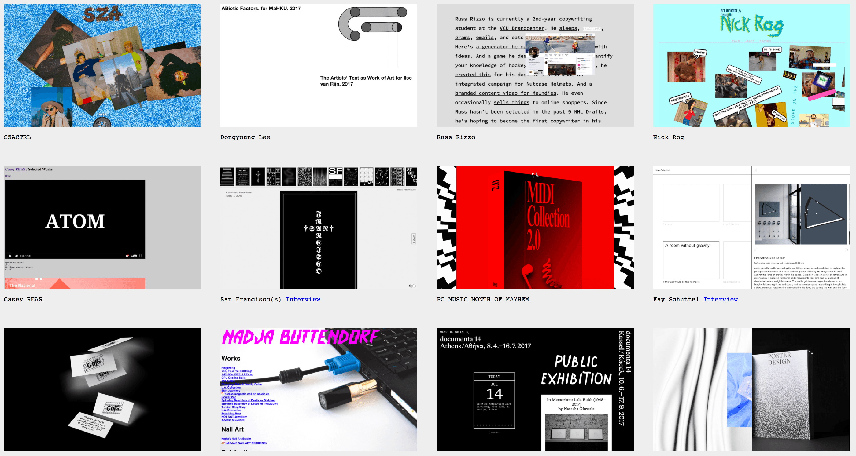
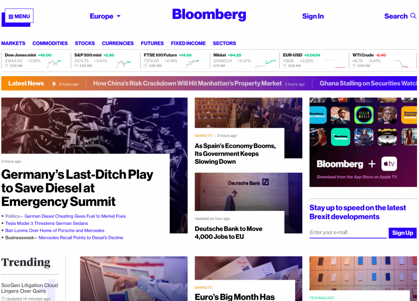
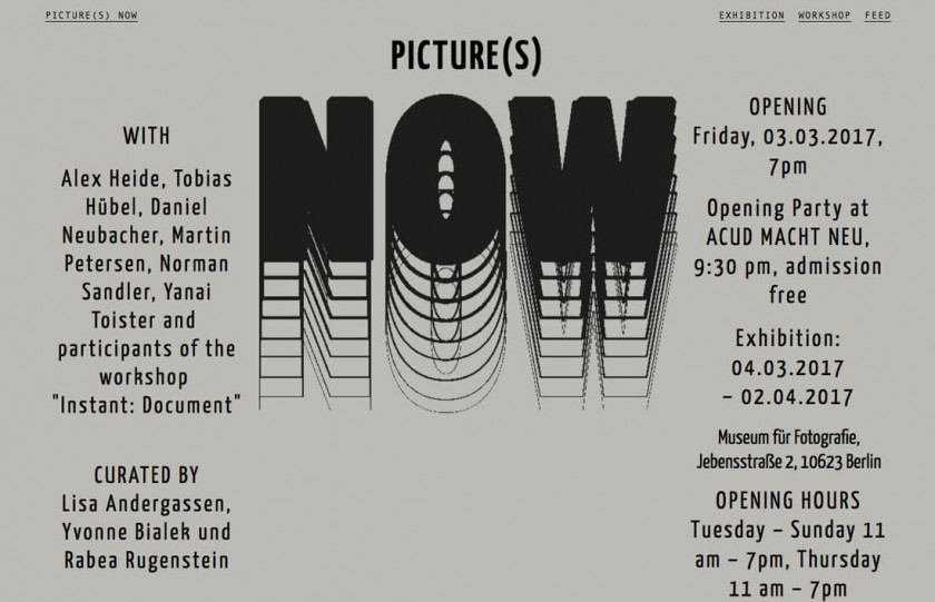
Even the Washington Post noticed the trend
“There’s an interesting trend in Web design these days: Making websites that look, well…bad.”
Seriously, that’s how they start.
Katherine Arcement, the author of said article, mentions Pascal Deville and his idea for a website. Working currently as a Creative Director at one of the ad agencies based in Zurich, Pascal founded brutalistwebsites.com. He lists there every possible creation that may be considered “rugged” and “lacking in concern to look comfortable.”
The funny thing is, even now brutalistwebsites.com receives over 100 new submissions a day. Asked by the Washington Post, he replies: “It’s not only what you can see, it’s also how it’s built. In the code you can see if it’s really a streamlined application or a very rough, handmade, HTML website.”
If we dig deeper into brutalistwebsites.com, we’ll find a self-published magazine that interviews the people behind the designs. One of them, Chuck, explains the concept quite easily.
His brutalist website was created back in 2005. “We were very intrigued by anti-design on the web at a time when so many people were using Flash and very clunky UI,” he recalls. “Our website was […] a content site with creative writing, so we felt it important to let that shine and not have design get in the way.”
Makes sense, doesn’t it?
Is brutalist web design trend here to stay?
We’re not the ones to decide. While it surely may serve some functions, or be entertaining, or simply fill a certain hole with something interesting, we don’t really think it has major commercial applications.
On the other hand, we may be wrong—hence, we’d like to hand the question over to you.
What do you think?


