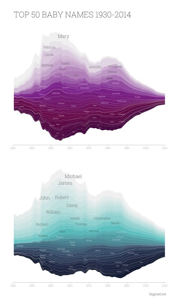
She said yes, so… how about baby names. Here’s a way of quickly finding out their popularity in a given time range.
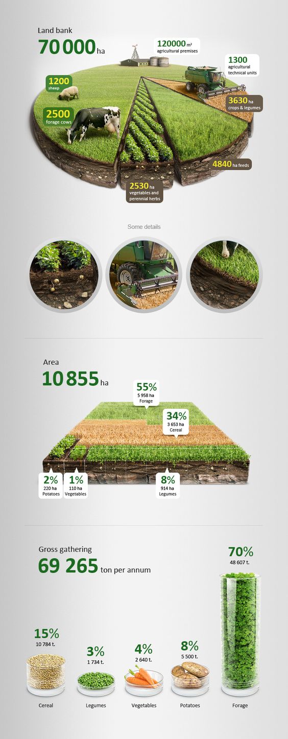
Here’s a good-looking infographic utilizing pictures.
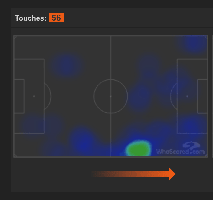
And here’s Kylian Mbappe’s heat map in the FIFA World Cup Semi-Final game against Belgium, showing the player’s activity on the field.
It doesn’t matter what kind of data visualization you choose, as long as it makes it easy for the recipients to digest otherwise raw data. Even the prettiest graph can be useless if it doesn’t serve its role. That’s why choosing the relevant kind of visual representation is key in successful data visualization.
If you find it hard to come up with the best way to visualize your data, try browsing the Data Viz Catalogue.
What is D3.js and What is its Role in Data Visualization?
Data visualization is a piece of cake if you have just a few data points. But the more data you want to visualize, the more automated you need the process to be. As you probably imagine, there’s a way of generating visualizations based on data, rather than drawing them manually. It’s called D3.js.
D3.js (or just D3 for short) is a front-end javascript library for manipulating documents based on data. In practice, it brings life to data with the use of HTML, CSS or SVG. In other words – it gives you the possibility to interact with data, and is fully compatible with all the popular web browsers, like Chrome or Firefox.
Why is D3 so great? Because it allows you to do pretty much anything you want with the data at hand. D3 makes visualization not only possible but also limitless. There are no restraints in kinds of visualizations this framework allows for.
Before Mike Bostock developed D3.js, there were, of course, some predecessors to it. But all of them required some plug-in to be installed in a browser before they could work properly. They had other limitations too.
D3.js is a game-changer because it’s not limited by the number of data it’s able to process, neither by the types of visualizations it’s capable of generating, nor by the customization capabilities. Bostock’s library, contrary to other frameworks, lets you manage even the smallest element and customize it to your needs. Above all, it seamlessly connects data with their graphical representation.
When to go with D3?
Truth-be-told, D3.js can get a bit complicated at times, but that’s the price you have to pay for unlimited customization.
Programming in D3 is always done from scratch. So, to start, you need to set up a workspace inside a container, create the X and Y axes, process the data and draw the desired graph using a preferred function. You can also add different styles and attributes for each data point or line. D3 additionally provides you with a few tools (functions) that you may find helpful for data management.
While creating a basic graph with D3 shouldn’t be a hassle, customizing it requires significantly more code to be written. More complicated visualizations demand plenty of work on the logic, data formatting, and the layout. But these are the keys if you want your visualization to speak for itself.
Despite the inevitable workload, D3 remains the go-to framework for data visualization. There are a few alternatives based on D3, however, like VEGA or NVD3 that can help out a lot with charting. One of the most notable D3 alternatives is called Sigma.js.
Sigma’s advantage lies in its ability to scale. It just copes better with graphs (and only graphs) based on enormous amounts of data. So if you have plenty of data to visualize in the form of a graph, then Sigma may be the way to go. It handles large graphs better and is more interactive, so you are free from the hairball issue that can be the case with some graphs.
But D3 is still considerably flexible. It can be paired with WebGL, which expands its standard capabilities regarding interactiveness. You can even animate each element, based on transitions similar to those in CSS.
The more complicated the visualization, the more computing power you will need. The aforementioned transitions could easily drain your CPU, but the issue can be fixed by adding parameters that will make browsers leverage GPU as well.
All in all, D3 is an outstanding library, with a tremendous community (plenty of resources to be found online), that allows for limitless data visualization and customization. Depending on the complexity of your project, programming with D3 can be either very simple or quite demanding. Regardless of the complexity level, however, D3.js lets you show data in a way that resonates.