insanelab.com insanelab.com

July 9, 2018 - Web development

Wireframes and Mockups: The Most Important Phase of Building a Website

Want to create a perfect website? Take the time to create a wireframe or a mockup. How will that help? Read on to find out.

The architect doesn’t just create the aesthetics of a building and hope it will be functional. The design process is way more complex. Architects need to think about both form and function. They need to design the paths that people will follow to get from one room to another. They need to think about every single detail – where are the common areas, where are some focus points, what are the interactions, how do people move between floors – and include all these in the project.

Then, they pass the project to an engineer, who ensures that the building is structurally sound and estimates the cost. At all design stages, the architect consults investors to make sure the project is aligned with their vision.

In the end, places like Burj Khalifa, the Shard, or the Guggenheim Museum are built.

Websites are their digital counterparts.

How to Create a Website?

Web designers are just like architects. They need to incorporate a lot of aspects into the design of a new website. Clearly, it’s a time-consuming process: but what actually takes all the time? What are the steps for creating a new website?

Before the website is designed and coded, you need to create an information architecture first. Everything that needs to be put on the website needs to be gathered and then distributed to the homepage and subpages. In this step, the website “organism” is alive. It moves around and constantly changes.

It would be extremely hard to adapt the design to ongoing changes once it is polished and considered final. Even if it’s not hard, it would take hefty amounts of time and resources. And these are costs that can be easily avoided.

This is why you need to start with a wireframe.

What Is a Wireframe?

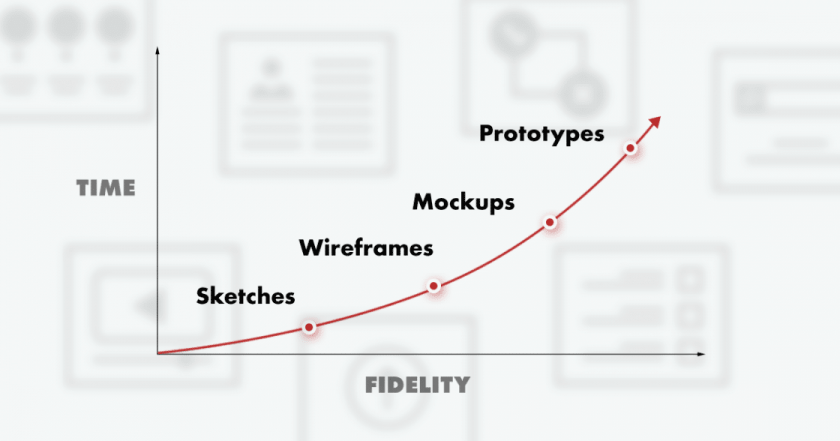
Wireframes within the web development timeline

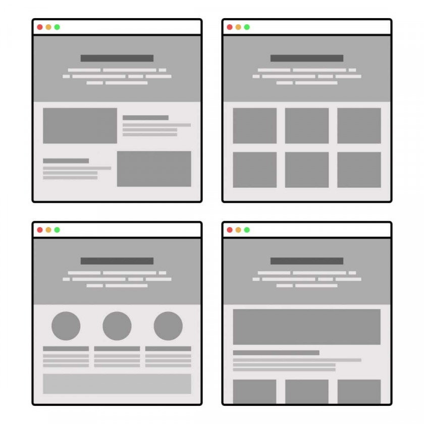
A wireframe is the blueprint of a website. It shows the information architecture with a low level of detail. Practically, it’s an interactive project, but with placeholders instead of graphics. It shows all the buttons and places where content such as copy, headlines, and images will be added later on.

Although it might not seem to be important, it is. Wireframes are there to give you a graphic representation of the overall layout of a website or an app. You could endlessly discuss the ideas and debate over choosing the ideal solution, or you could just put a wireframe to work and test it to see if it works.

The main advantage of wireframes is their low cost. They allow web designers to test ideas and move easily from one idea to another, to make sure no section is lost along the way – or if it is lost, it’s lost on purpose.

Changing the wireframe is easy as well. Since it doesn’t cost too much and can be made quickly, it’s the perfect tool for laying the foundation for a new project.

The Role of UX

Just as a real architect designs paths, the web designer has to do the same. In fact, that type of designer is called a user experience (UX) designer.

The wireframe is also created for UX design purposes. It requires quite a lot of experience and knowledge to create the first version of a layout that will allow users to move around the website effortlessly. And again – the initial design should be tested.

The purpose of testing a wireframe is to provide a test environment just for interactions. The graphics are unimportant at this stage. All that needs to be tested is whether the buttons and layout perform properly in test scenarios.

Also, remember that you need to be prepared for mobile-first indexing.

Here’s an example of how it looks in real life. With the wireframe in place, you ask your test group to find the street address of the company that the website is for. What button will they click? Is it “About Us,” “Contact,” or “Our Office”? Does anything create a distraction? Are the users unsure of the steps they should take? These are the interactions you test with a wireframe.

Architecture that allows users to find the information they want instantly is what differentiates a poorly designed, mediocre website from a serious, high-quality one.

But… Graphic contrasts and actual content can affect the experience, can’t they? That’s why you might consider using a high-fidelity wireframe.

Wireframe Fidelity: Low vs High

Everything in the previous section refers to low-fidelity wireframes. Those have placeholders and as little graphic design as possible.

But, although they are enough for UX testing purposes, sometimes low-fidelity wireframes are not enough. They don’t show the general idea of a final project. In fact, they hardly reflect the project at all.

That’s why designers often turn to high-fidelity wireframes, also known as mockups. They are still static and only show the most basic functionality. However, they include contrasts in greyscale, images, typography, copy – at least headlines and subheadings – and everything else that is supposed to be included in the project. In short, high-fidelity adds visual richness to the layout that proved to work in earlier steps.

Try showing a low-fidelity wireframe to a stakeholder or a client. Without the complete background, someone who invests in a website can have a hard time verifying that it will fulfill its purpose.

Using mockups allows the designer to communicate with a client on the same level. You can discuss the visuals, the influence of brand design, the weight of graphical elements, and anything else that is visualized there.

High-fidelity wireframes allow stakeholders to review the visual side of a project and discover clashing elements. It’s easy to find the best balance between typography and images. And the useful aspects of the low-fidelity wireframe – for example, fast iterations and adapting the project to changing ideas – are still there.

In short, the mockup is the middle stage between the wireframe and the final design.

And since we’re talking about the final design… High-fidelity wireframes enable you to come to a consensus on the layout and general design of a website. With that in place, the designer who will work on its final form can focus on the creative work. The placement of elements across space is no longer an issue: the designer just needs to make these elements look beautiful.

Even a high-fidelity wireframe is still pretty basic. What if you wanted to see all the colors and interactions, and get an idea of the final outcome? You design a prototype – but we’ll cover that next time.

Wireframes and Mockups. Which to Use and When?

As we described, wireframes and mockups each have their pros and cons. Naturally, the mockup will flow out of the wireframe, but sometimes a mockup is not an option.

It all comes down to a certain project specification. With complex structure and loose frames, it’s best to follow all the steps – design a low-fidelity wireframe first to make sure you don’t lose any of the information during the process and set up the best UX. Then move to the mockup, and then to a prototype.

But if project specification is very detailed or the project itself isn’t that complicated, you could start with a mockup. This enables you to design the website or app faster while still keeping the costs at reasonable levels.

There are many tools – free and paid – for creating wireframes, but it requires UX design knowledge, skills, and experience to design a good website blueprint. If you don’t have these skills in-house, that’s not a problem. All you have to do is hire an experienced agency.

Learn how to vet a software agency.

And them

What is your challenge?

Tell us with any means provided. We'd love to hear from you!